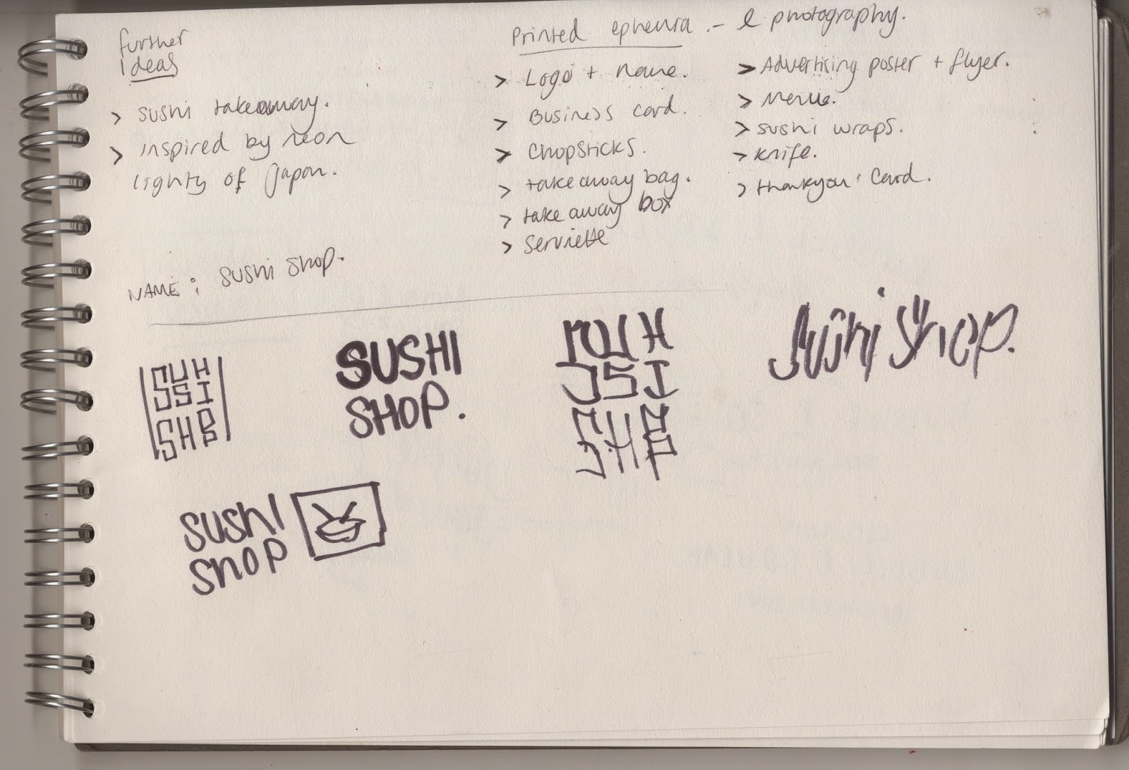
After looking into Japanese culture and at the neon lights that make up the city, I jotted down my ideas to see what direction I could the brief in. I wanted to make something very modern, bold and colourful.

I wanted the logo to hold significance to Japan, so maybe it could include the Japanese glyphs. I sketched out some ideas before taking them onto the computer to develop them.
I started with a font that was quite large and round, i felt like it was very similar to the type of cartoon anime style writing that is used in a lot of Japanese animation.


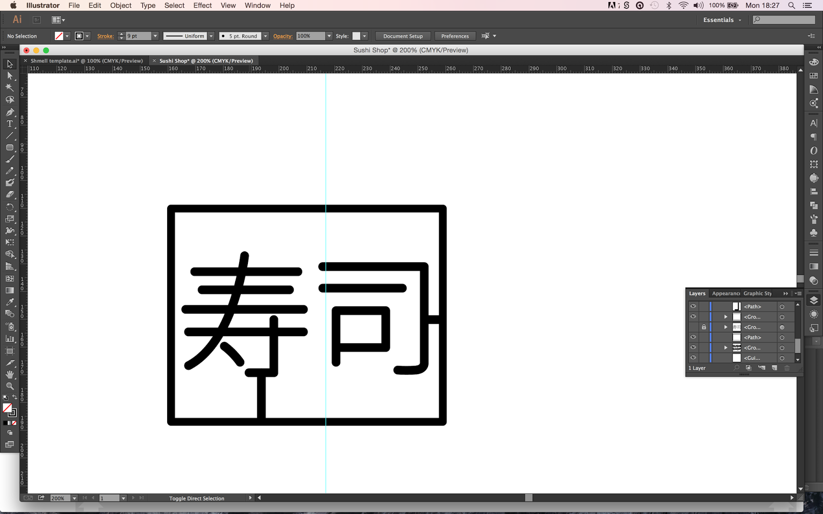


I wanted to use black as the background, and then typical neon colours, Magenta, Cyan and white as the logo colours. I felt like by using the black the logo would stand out more.


I also tried making it look like the sign was hanging.

I decided from here to develop another idea that I had, just so I had a range of ideas that I could then choose from.

I wanted a bowl and chopsticks to be reflective of the neon lights.


When I went for an interview at pinfold I showed the people who interviewed me the design and they gave me some useful feedback. They mentioned that the text looked more like a sweet shop font and not that Japanese. They told me to try and make the Japanese glyphs the centre of the logo, or to at least make them bigger so people no its Japanese.
I took the feedback and tried to develop my idea. I decided that instead of filling the text I would have it as a stroke and then using the stroke I would add gaps to try and make it look more like glass tubing.


I did the same with the glyphs, and made them stand out more next to the name.


Here is the finished logo:

Once the logo was finished and I had the aesthetic that I wanted I started to apply the logo to different things. I didn't want to just paste it on everything so I tried to adapt it on to all the different deliverables.
I added the logo to a business card. I made the business card a bespoke shape. I wanted it to be different, but I also wanted the logo to fit perfectly onto the front.


I then designed labels to be put onto the packaging. The packaging came in small, medium and large.


I then designed the menu. For the front of it I wanted it to be similar to a Japanese high street at night, with all the different lights and the different brightnesses.


No comments:
Post a Comment