Extended Practice level 6 - Dan Everitt
Labels
Tuesday, 19 May 2015
Monday, 18 May 2015
OUGD603: Fashion Branding Final Resolution
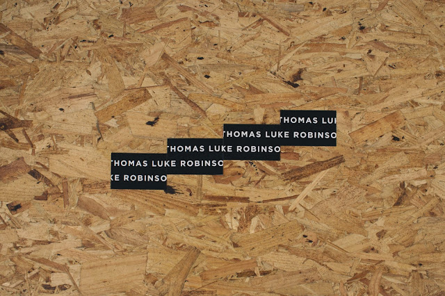
So for Toms business card I chose to display his name big across the front as I felt this represented how bold he was, and created impact.
Sophie's final design was light and elegant:
Saturday, 16 May 2015
OUGD603: Fashion Branding Ideas & development
Sophie wanted me to incorporate a light pink into her design, and she wanted her logo to be her name, clean and sleek across the front. It was a case of me choosing a font that she liked.
I added the needle underlining her name to just add a little extra to the design. this symbol could also be used on her other printed collateral. In the end she chose Gill Sans as the font.
Tom also asked if I could design a set of swing tags using the animals that he made his fake garments out of:
I left Tom with a rang of ideas and let him choose which ones he wanted:
Subscribe to:
Comments (Atom)


