Labels
Showing posts with label Monotype. Show all posts
Showing posts with label Monotype. Show all posts
Monday, 9 March 2015
Friday, 6 March 2015
Thursday, 12 February 2015
OUGD603: D&AD: Monotype Initial Ideas & Development
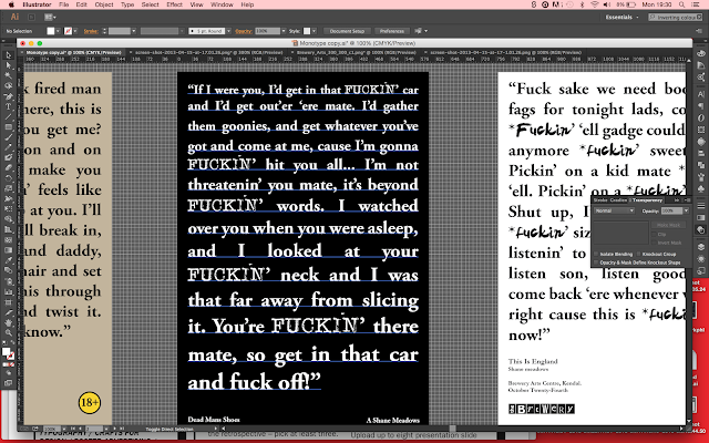
I started by thinking about a concept for my poster design. I decided to choose Shane Meadows as the director as I have seen most of his films and I am familiar with them.
I was able to compare each film and found that there i always an antagonist who loses the plot and lashes out violently. I decided to have each poster as the quote in the film where the character switches. I started playing around with the quotes, seeing how I could lay it out onto the page.
I originally had the text as a san serif font put decided on using a serif font as it seemed to fit the quotes a lot better, they had more character which added to the character in the quote.
With the idea below I took the phrase 'Colourful language' and replaced all the swear words with a block of different colours.
I felt like hiding the swear words changed the tone of voice of the poster completely so I decide to stick with the profanities.
In the end I chose black yellow and white as I felt these were quite powerful colours and both contrasted really well with the red text. I increased the point size as the quote goes on to show the increase of volume in the characters voice, and to show anger.
Wednesday, 11 February 2015
OUGD603: D&AD: Monotype Research
I looked at a few typographic and non film typographic posters, I wanted to see what ideas were already out there and to see if I could get an inspiration to get me started.
I like how the use of typography is used to create in image, although images are not to be used in the design.
Subscribe to:
Posts (Atom)


