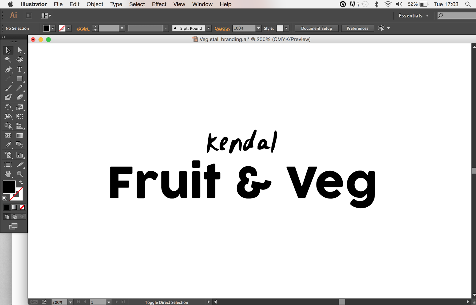
I found myself designing in the style that I had previously used for the cleaning branding, and this was not what I wanted to do. The veg stand is a traditional, locally sourced, fresh produce stand which has a very rustic, local feel about it. I really want the design to reflect this, so I stepped away from the cartoon kind of style.
I thought maybe having quite a sketchy style was more appropriate, maybe something more free hand that would bring across a more personal, hand picked feel to the design.
I also sketched out a few logo ideas that I thought were appropriate:
I took my sketched ideas onto the computer and played around with a few different ideas.
After completing the name/ logo (below) I asked my class mates what they thought about it. I was given some helpful feedback:
> The grunge aesthetic worked really well and made it very traditional/ rustic.
> The hand drawn 'kendal' was a bit to stiff, possibly try make it flow a lot more.
> The fruit and veg section is maybe a bit too big and bold.
After taking on board the feedback I decided to tweak the design a little bit.
Below is the design I decided upon:


No comments:
Post a Comment