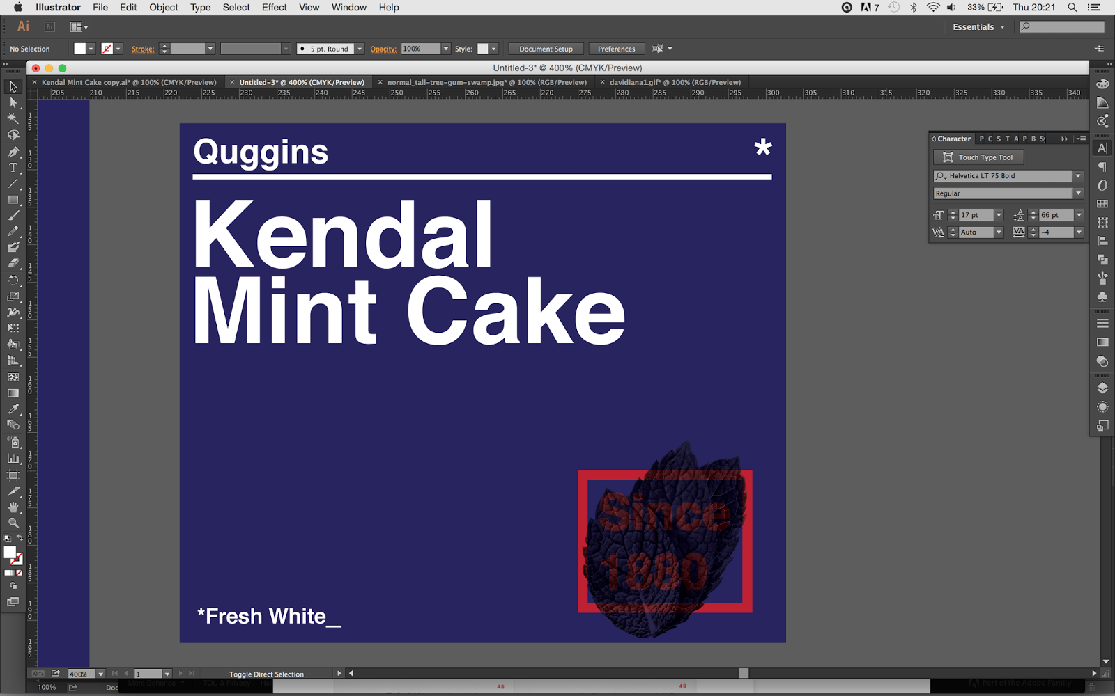
So after developing the logo I begin to develop the idea. I found a perfect mock up for a bar of chocolate which fit the perfect size of the Mint Cake packaging. Not only is it small, but it's a size that Quiggins have used in the past.
I developed my design whilst having the packaging as the background to see how it could work. I was keeping the design quite playful and illustrative.
I added extra information to find out where it worked best n the packaging.
I then tried to see how it could work on a poster.
I then began to add more detail, keeping the style the same.
After developing the idea I had a mini crit with my two housemates, I presented them with a few ideas of the packaging, and where I was heading with it.
Feedback
> If it's aimed towards mountaineers maybe try and steer away from making it really playful and illustrative and maybe make it more formal
> The Quiggins logo works well but the 'Kendal Mint Cake' is a bit too much
> Maybe add more information onto the packaging, and whats the back going to look like?
After taking the feedback I decided to go back and look at the medical packaging. I realised that I was designing the packaging in a style that would be more aimed at children, which is not what I wanted.
I started redesigning the packaging, giving it more of a swiss modernist twist.
I thought if I make the name bold I could use this as the selling point, and also I could maybe add actual photographs of the ingredients or flavours. I really liked the idea of using the date that the company was established, It keeps the traditional element in the design, but the actual layout and style shows how the bar is more modern.
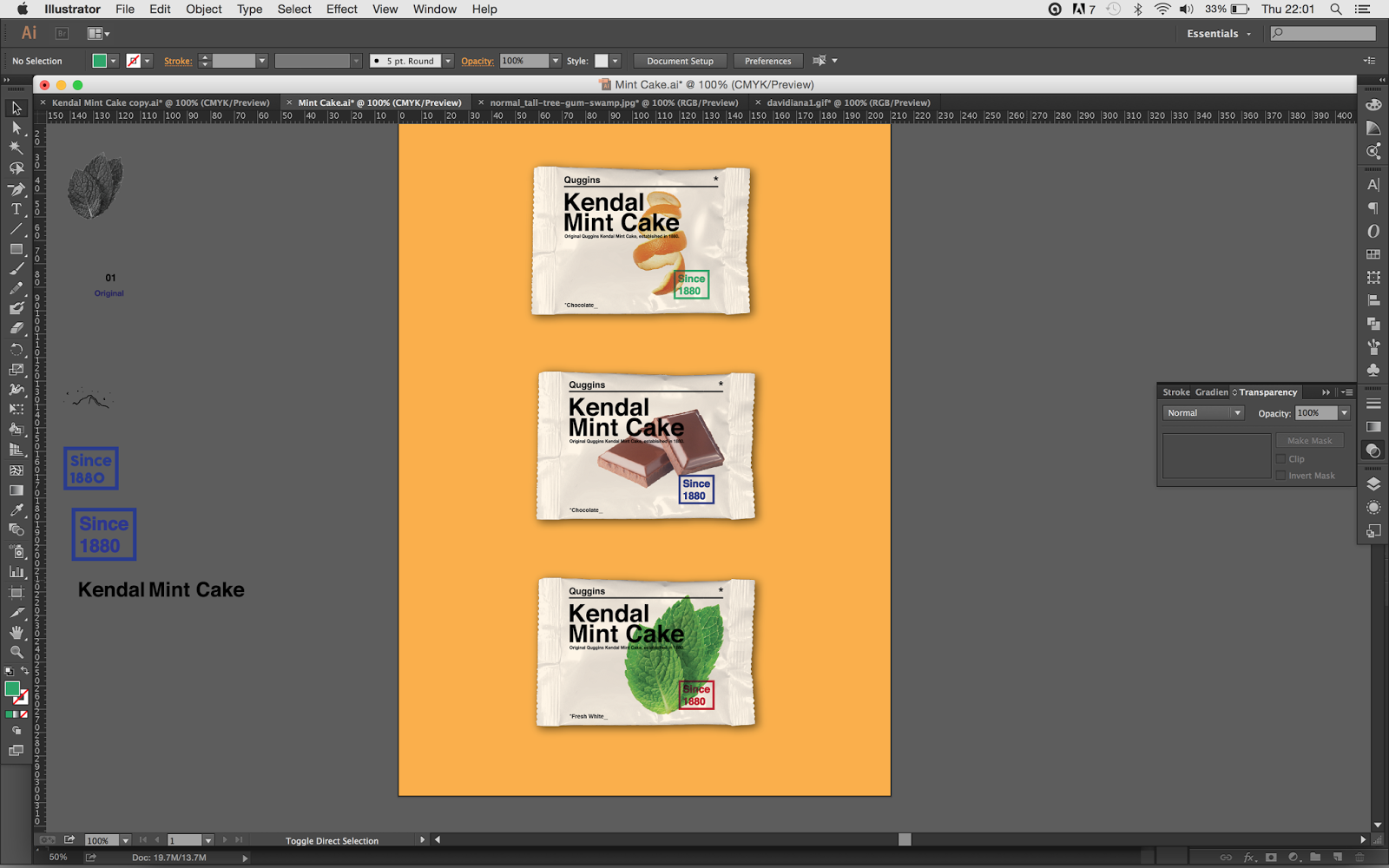
I've kept the company smaller than the name of the bar as the name 'Kendal Mint Cake' is what people would recognise. I found a photograph of three peppermint leaves which I applied to the packaging.
I tried having the leaves as different duo tones and also tried it with its original colour.
I stuck with the idea of having the pictures on the front in colour. For the original flavour I had peppermint leaves, for the chocolate coated I had bars of chocolate, and for the orange chocolate flavour I found an image of orange peel.
I played around with the 'since 1880', making it a different colour for each bar, I also applied the mockup to a colourful background. I wanted to keep the front very simple, so i kept the information small and aligned.
I also produced some posters using the images and the date
I decided to keep the 'Since 1880' the same colour across the range of bars, it was more formal, and they weren't particularly needed as you can tell them easily apart by the images on the front.
I played around with the information on the front, and tried to arrange into something that looked professional.
I decided on this design in the end. I felt it kept everything simple, but had a certain quality about it that I really liked.
After producing the front I then continued onto the back, keeping the design minimal but effective.
Here I arranged the icons at the bottom so that they fit with the structure of the rest of the packet.
After making sure all the packets were perfectly aligned I applied them to some different coloured backdrops.
When saving the images as JPEGs and finalising my idea I realised that I had been missing an I out of Quiggins.


No comments:
Post a Comment