Here I have tried to familiarise myself with different designs that would be similar to what aesthetic I want.


Above, these brands identify a very rustic/ grunge look, which is something I'm hoping to portray in my design. As well as this look being portrayed through the logo I'd like the traditional look to be used throughout the identity, to create not just a rustic look, but a rustic feel.
Relevant rustic aesthetic:


Rustic interior


The Aesthetic is not only just about what you see but what you feel. I believe to really get across this rustic look I need to consider different types of stocks, possibly sustainable and recycled stocks that can add to the grainy feel.
From my knowledge of stocks I'd think about printing onto grainy uncoated stocks.
I have a book of stock from GF Smith which has helped me to decided on some stocks that I could use.


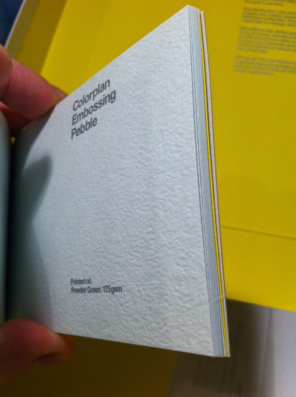
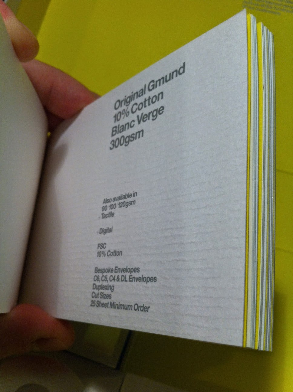

Out of all the grainy stocks that the book provides I liked the 'Strathmore Grande Ivory'. I felt like it had the most rustic feel to it.
No comments:
Post a Comment